A few key things you need to know about improving site conversion:
- It’s about what NOT to do, as much as it is about what TO do.
- You have to know who you are (as a brand), and what your customer wants.
- You give it to them.
Sound simple? It is. Some of the most fundamental things you can do to improve conversion are the simplest. And yet, so many brands are missing out on fixing these key friction points in the shopping process. Here are the five key areas of focus you should get right before you consider anything else:
1. Navigation: This is where you need to take off your marketing hat, and put on your customer’s. Shop your own site. Make sure everyone on your team is doing it. Get feedback from everyone- especially real customers. A few must haves for your checklist:
- A prominent search box, with predictive results.
- Top navigation categories that are easy for a new customer to understand.
- Refinements and filters, to allow a customer to quickly drill down to what they want.
- Inspiration, by way of content, new products and/or solutions on your homepage to inspire the ‘browsing’ shopper .
2. Site speed: If your site is slow, it will hurt performance both from a conversion perspective (high bounce & exit rates), and from an organic perspective- a slow load time will affect your Google ranking, especially if your site is slow on mobile. A few checkpoints:
- Check your mobile site speed using Google’s free tool, here. It will tell you your average load time for mobile- and your estimated visitor loss based on load time. Now see how your competitors stack up.
- Use your analytics tools to see page load time for key landing pages, and look at your top exit pages. This will give you some priorities for where to start.
- Work with your developers to optimize clunky code, pixels and functionality to improve.
3. Product info: There’s a time and place for everything. Provide the right info, in the right steps along the shopping path, to enable the next click. A few for your checklist:
- Crisp images, with zoom and alternate views.
- Thorough product descriptions, with practical info about how to wear, how it fits, how to choose a size, how to use and care for.
- Links to ‘live chat’ and ‘shipping’ info.
- Price: clear sale or promo info.
- Prompts to remind customer of value-propositions that will inspire confidence, i.e. “Fast, free shipping” or “Our guarantee” or “Easy returns”.
4. Shipping: Free and fast. Don’t give your customers a reason to buy it on Amazon. Enough said.
5. Checkout: Don’t get in your own way. Take a look at the metrics around your shopping funnel to see which pages of checkout are seeing the most attrition. Consider:
- Clear, uncluttered first page of checkout that offers Guest Checkout as well as Registered user checkout.
- Mobile payments: if the customer has to get out their wallet while shopping on a mobile device- you’ll lose momentum- and potentially the sale.
- Standard, fast, and faster delivery options showing cost and expected delivery dates.
- A minimum of interference- don’t get in the way of a customer’s intent to checkout. If you’re up-selling services or products- keep it simple, and keep it outside of the customer’s focused path.
Keeping your shopping path frictionless will take on-going care and vigilance. If you’re highly focused on these, you’ll be more likely to capture new customer sales- and less likely to annoy your loyal repeat customers. The rewards are great- for everyone. Improving the shopping experience will always serve you, and your customers well.
Grocery delivery services are an absolute lifesaver when you just don’t have the time to get to the store. It is amazing what you can get delivered to your door: prepared foods that are actually good, meal kits, fresh produce, and anything you need for the pantry.
Early this year, I was living in a different city during the week, and coming home just for the weekend. I was beyond exhausted, from the driving, the working, trying to keep two places in order and living out of a suitcase. During these months, I tried all the online grocery options available to me: Amazon Fresh, Fresh Direct, and Shoprite. They all have their pros and cons, but overall, the state of online grocery shopping is not where it needs to be to make it my go-to during normal times. Not yet.
On the positive side, I no longer have to lug heavy water bottles, dog food or mega packs of paper towels and toilet paper from the grocery store. It’s Amazon Prime, all the way. I am very happy not to have had to visit a pet store in over a year.
Below are my ratings for Amazon Prime, Fresh Direct and Shoprite, across 6 key areas.
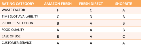
The waste factor
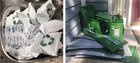
Amazon gets the F in this category. My last delivery came in huge insulated totes that were ridiculously under packed, and filled with excessive amounts of padding, cold packs, and dry ice (which burns if you touch it, as I found). It took me over 40 minutes to break the totes down- they are filled with hard sided padded panels to keep them sturdy, as well as bags and bags of dry ice and ice packs, all of which have to go in the sink to melt before you can empty them. When I had completely emptied the bags- my sink was full to the top with these packets. It was a ludicrous amount of waste. And worse, they’d sent an excessive number of totes. Three of them had only a product or two inside- with all that padding and cold packs on top. One had a single bag of frozen peas in it. Another had a bunch of asparagus. In another tote, they’d packed heavy 12 packs of drinks on top of cereal boxes, crushing them. When I called in about this, Amazon said that machines pack the bags, so sometimes the logic is a bit off. I’ll say. Below, a few images of the debris.
After this debacle, I actually called to ask Amazon to cancel my Fresh membership.
Fresh Direct uses cardboard boxes- bulky, but easy enough to break down and recycle. Shoprite gets the A for using regular grocery bags without any excess packaging.
Time slot availability
This is one of my pet peeves with all of them. I learned the hard way to check for delivery slots before spending the time to fill my cart. To achieve true convenience, these services need to make quicker delivery available, and more time slots available in general in the near term. The true convenience would be to realize on Friday or Saturday that I don’t have time to shop, and to be able to get a slot for the next day. In reality- the best case scenario on a Friday is to get a Sunday 8-10pm delivery slot. You really have to think ahead, which isn’t always possible- and if you’re out of food for the weekend, it doesn’t help. On the upside, if you do plan ahead- you can set a time slot by putting anything in your cart ahead of time, and then you’re given until a certain time the night before (11pm with Fresh Direct) to modify the order. Unfortunately, it’s not always possible to anticipate running out of time to get to the store. If these services could do same day or next day delivery on demand, that would be the A+.
Produce selection
Fresh Direct was the best on this. I never had to throw anything out. Sometimes I would get something a bit unripe, but it was never too far gone. With both Amazon and Shoprite, I’d actually have to throw things away or call them to get credited for bad produce. Not terrible, most of the time, but not consistently great, either.
Food quality
Aside from produce and meat, for the most part, they’re all good here. Fresh Direct is the one I’m most comfortable ordering meat from, and they have by far the best prepared food options. I wasn’t impressed with Amazon’s- and the options weren’t great- often, the meat wouldn’t be available for the delivery slot. Shoprite’s was consistently ok. I find if I ask for the organic, it’s always best, vs. leaving the choice to them.
Ease of use
Fresh Direct is the clear winner for ease of shopping. The navigation is clear and easy to use, the search is great, and best yet- I can fill my cart with the items from my last order and edit from there. Amazon’s navigation and search were good, but it always took me longer. Shoprite’s was terrible- every time I went to the site, I’d have to work at just finding my local Shoprite location to order from- it never remembered me. And they don’t deliver in my area-they shop, but you have to pick it up.
Customer Service
When something goes wrong- they are all responsive and customer centric- quick to credit you if something wasn’t good or right. Amazon went the extra mile, and put $ in my account as an appeasement when I called to complain about the ridiculous packaging and crushed groceries. The agents were always quick to answer, friendly, and accommodating.
So what’s next?
Ideally, online grocers will scale to accept orders on a shorter delivery window- this is what they need to do to make it a true convenience, and what’s needed to make customers like me return again and again. I don’t trust them to be there for me when I need them, because I can never get the time slot I want. This is the key reason I don’t use them except when I absolutely can’t get to the store. With Amazon’s purchase of Whole Foods, I’m hopeful they will find a way to deliver locally more easily, directly from Whole Foods- competing with Fresh Direct on quality, and beating them on speed to home. I would also like to see them get more efficient with the packaging. To become my go-to, it can’t be a project to unpack and break down packaging and recycling. I don’t want to create that much waste, and hopefully they don’t either. Online grocery shopping is one of the most amazing conveniences of online retail, but there’s work to be done to get it right.
Everyone’s talking about the death of retail, and what’s next for eCommerce: AI, IOT, and so on. This, combined with today’s more brand agnostic customer, is enough to make a retailer despair. But let’s face it- people are still shopping. Retailers need to up their game to stay in it- and to avoid being eaten alive by Amazon.
While there are so many epic things on the horizon to do- there’s one fundamental opportunity that most online retailers haven’t figured out yet, and hardly anyone is talking about: immediate gratification. The impulse purchase. If we can figure out how to make that easier, faster and better- we’ll have something.
Apple pay is a step in the right direction- it makes it easy to buy from a compelling email in about two seconds. The first part of the impulse buy is there- but I still have to wait for that package to arrive.
Amazon has us all trained to expect 1-2 day delivery on everything. Forget paper towels at the grocery store on Sunday? Amazon can have those to you by Tuesday. Most retailers have followed suit with at least free standard shipping. But anything that takes 3-5 days is like waiting an eternity. I find myself thinking- didn’t I order that WEEKS ago? The new standard is fast. If I could have gone to a store to get it by now, it’s taking too long. But what if I want it today, and don’t have time to go to a store?
Back in the internet boom- Urban Fetch was a great start-up in NYC that would deliver anything within an hour- bagels from your favorite place, the book you need for your daughter’s English class by tomorrow that she forgot to tell you about…a present for a baby shower, etc. It was the best thing ever. But they didn’t survive- it just wasn’t cost effective. It’s surprising in all this time, that no one has figured out how to do this at scale for fashion- it exists for food- Seamless, Instacart, Uber-eats. But not for fashion.
If stores, every major brand, including department stores, could figure out how to deliver same day- within hours, this would create a huge paradigm shift for shoppers. Fashion brands need to be looking at how to facilitate this & stock the stores for it. If I have to go home, and think about it, or wait for it- I might change my mind. Yeah- it’s online in the end, but the stores become local points of distribution.
Everlane has it right: in NYC, they’ll deliver within an hour. BAM. I need a raincoat or a new bag? Instant gratification in 5 minutes of browsing on my phone. But who else? Even with online groceries, I have to set my delivery window 48 hours out (more on that in a future post). The model here has to change.
On a recent trip to the mall, I experienced the worst of mall madness- it was the day before Father’s Day, and it was mobbed. Every store was a mess- like Macy’s the week before Christmas. Even shopping in Nordstrom was so unpleasant, I couldn’t begin to find anything good, because the tables were a mess- it looked so junky and worked-through. I wasn’t shopping for Father’s Day, thankfully- so was able to bail, and just shop online without the stress.
Will people still go to stores? Sure. There will always be those last-minute shoppers, and the delight of discovery- finding something you weren’t looking for & didn’t know you needed ’til you stumbled across it. But stores need to get more creative about making the experience of shopping worth that effort. Burlington, VT is a great example of this- Church street is closed to traffic, and filled with retailers and restaurants- making it a great place to shop, eat, meander and discover. The nearby mall is empty. Malls are becoming a depressing and uninspired destination. But that’s a story lots of others are already telling.
For the time-being, people will continue to be pressed for last-minute shopping, and until online retailers can figure out how to deliver same day, those shoppers are going to the mall.

Work-Life Balance
Life/work balance. We all grapple with it. Sometimes it seems as if we’re running too fast on both counts, barely making it between the two- always leaving things undone or in the air. When one aspect of your life becomes overly demanding: (A). sick kid, (B). sick pet, (C). something breaks in the house, (D). someone quits at work, (E). new job, (F). it’s Q4 in the retail industry, or (G). all of the above, it can seem as if you just can’t do it all. And some days, you can’t.
You can be thoughtful and well planned- and still hit that wall. For me, the key has always been to make sure I’m prioritizing based on what’s most important. Sometimes, you have your priorities set, and then BAM: a THING happens. This is where you have to drop the stress of doing IT ALL, and re-prioritize. What do I need to do right now? Figure out how to reorganize the rest later.
Re-prioritizing is important, both because priorities change based on the surprises in our week, but also based on so many other factors. Take the time each night and morning to rethink the day- take a look at the rest of the week, and re-prioritize. If you don’t do this, the risk is that you spend all of your time showing up, reacting, and not focusing on the things that need your utmost and full attention, simply because they’re not the most urgent right now. And yet- you may be continuing to push the more critical, harder tasks out.
There are a million articles, posts, and platitudes around what constitutes balance. Everyone has an opinion. They may say your personal time is your personal time, and you should leave work at the office. Or that you must turn all electronics off after a certain time or your brain activity will go haywire. Or that you need at least 7 hours of sleep or you’ll die young and have reduced brain capacity. The list goes on. Read them, use what resonates for you, and let the rest go. You work every night and on the weekend, but that makes you feel better about how you’re starting your week? Cool. You take 2 hrs for yourself every night and never work on the weekend unless it’s an emergency? Great. The real balance is to do what works for you.
There is no magic bullet for balance in your life. Repeat: THERE IS NO MAGIC BULLET FOR BALANCE.
Again, it’s about prioritizing. What’s most important for me, right now, tonight, tomorrow and this week? What are the things I absolutely cannot miss? Where do I have flex if I need it? What are the conflicts between work/life this week? What are the priorities of those conflicts, and what am I going to do to make it work, i.e. daughter’s ballet recital is non negotiable- well, decision made. Move the work stuff around. CEO meeting is non-negotiable- of course. Move the personal stuff around. See? You have to negotiate with yourself (not the universe of work/life balance philosophers, not anyone who’s judging you or doing it differently), and just, as Tim Gunn says, “Make it work”. Make it work for you.
So, in summary:
- Don’t let your environment, conditions or events completely kidnap your day.
- Don’t let the universe of self-help, theory and linked-in/facebook philosophers tell you what life/work balance is.
- Find what works for YOU, and stick with it.
Don’t let Balance be a bully in your life.

Made in Detroit.
I just stumbled on this lovely site today- via an ad in the New York Times.
Shinola.com is based in Detroit, with a mission to make an investment in “skill, at scale.” Making American luxury goods great again, while reinvigorating a city that needs it.
“Why not accept that manufacturing is gone from America? Why not let the rust and weeds finish what they started? Why not just embrace the era of disposability? And why didn’t we buy a warmer coat before we moved here?”
Launched in 2013, Shinola’s founders were driven by the mission of building a factory in the economically depressed city of Detroit. In an interview with Forbes magazine (Ariel Adams, 2013), Shinola tells the story (you can see it here). Shinola partnered with the Detroit Economic Growth Corp. and the College for Creative Studies, who ultimately became their landlord.
The brand started with watches, and now sells leather goods, bikes, journals, and more. Each product group has a story- centering around where it’s made, how it’s made, and with sustainability, community and authenticity in mind.

Love getting designer fashion at bargain prices? If you really want to save, there are a number of great options online where you can shop for gently used, even unworn fashion at thrift shop prices.
The behemoth, of course, is ebay, with infinite options if you know what you want and have a lot of patience, but the experience isn’t pretty. Now, there are a number of delightful online boutiques where you can shop online for gently used, or new fashion at thrift shop prices.
It’s not just about bargains, it’s a great movement towards sustainability and re-use. Not wasting. Getting rid of things you don’t love, so someone else can enjoy them. And making it easy to do so.
Thredup.com
Thredup  has “like new clothes from designers you love”. You can shop and buy, sell, or donate your unwanted clothing. The beauty of it is how easy they make sending your clothing in. Thred up will send you a bag, which you fill and send in. You can opt to sell your clothing outright, or on consignment. They’ll evaluate your clothing for salability, and you can have the unaccepted clothing sent back to you or donated. 5% of all purchases go to charity- you can even choose a school for the $ to be donated to.
A few excerpts from Thredup’s DO GOOD page:
It takes an average of 700 gallons of water to make a piece of clothing, so we’ve collectively helped save over 3.5 billion gallons of water—about the same amount of water the city of Los Angeles uses over ten days! We’ve helped families put nearly $10 million back in their pockets and saved shoppers more than $40 million compared to what they would spend buying new.
We’re committed to supporting organizations that make our communities stronger. Every year, we donate 10% of our Clean Out proceeds to Teach for America. We’ve also made it possible for customers to donate their Clean Out earnings to nonprofit partners, and to use Clean Out to fundraise for the causes you care about
It’s a great concept- and it’s based on doing good, conservation, and helping others. What’s not to love? You can see more about how thredup works, here: https://www.youtube.com/watch?v=4DCf7-p8g-4
The RealReal
The RealReal is an upscale designer consignment shop where you can “shop designer brands like Chanel, Louis Vuitton, Gucci, and more at up to 90% off retail prices.
 You’ll find everything from a $70 bag to a $2000 handbag on the site. Neiman Marcus has partnered with RealReal, and is offering a $100 gift card if you consign 10+ items with RealReal. If you want to consign, RealReal offers free shipping & pickup for your items. This isn’t particularly “thrifty” thrift shopping, but if you’re coveting a Gucci or Prada bag, you’ll get a deal.
Eileen Fisher’s Green Eileen
 While Green Eileen is not available online- it’s the beginning of a worthy trend in fashion, one in which the brand itself is taking a stand on sustainability and recycling. Green Eileen accepts gently used donations of Eileen Fisher clothing, which it will sell in flagship stores at a great discount, with all proceeds going to “support programs that improve the lives of women and girls in our local, national and global communities.” For more information about Green Eileen and Eileen Fisher’s sustainability program, see Green Eileen.
While recycling and re-use hit a tipping point with ebay years ago, mass retailers haven’t found the right way to make this work yet. Lots of brands have experimented with it- Gap, Banana Republic and J.Crew have all run programs encouraging customers to bring in gently used clothing in exchange for a discount, as one-off events. Thredup makes it easy to donate, and easy to shop great brands inexpensively. It’s a better experience than a thrift shop, with a great way to build a wardrobe on a budget. RealReal takes your gently used designer fashion, handbags and more on consignment- with a quick turnaround, and a 70% cut on the sale.
It’s good to see more brands doing this online. The more we can avoid living in a throw-away world, the better. For all of us.
 Jet.com makes a serious play to compete with Amazon

The approach is based on a lower pricing strategy, combined with fast delivery. It’s a major, gutsy play for Jet.com’s founder and CEO, Marc Lore. No one has seriously tried to beat Amazon on price – until now. But if anyone can do it, the founder of Diapers.com, Wag.com and Soap.com can. After successfully building these powerful brands, defined by amazing branding, customer experience and convenience (personalization- reminding me that it’s time to reorder, and making it easy to do so; free 2 day shipping, even on a 40lb bag of dogfood), Lore sold Quidsi brands to Amazon for over $500 million.
So it’s just a little bit epic that he’s going after Amazon now.
 The key differentiator for Jet.com is that Lore creates beautiful and engaging customer experiences that create a devoted customer base with loyalty and an emotional connection to his brands. And from that perspective, Jet doesn’t disappoint. The site has a powerful brand identity and a great customer experience. The search is powerful, the sort features are what’s needed, and the selection seems robust. The homepage promises ‘club price savings’, which alludes to Costco as well as Amazon’s prime pantry. Jet is going directly after Amazon on price, showing comparative pricing against Amazon on every item, to demonstrate the savings.
How is Jet.com doing it? They’re sourcing wide and far- and instantly serving up the prices that are lowest based on your location and things that are cheaper to ship together. Jet will show ‘smart savings’ on items that work well together. every time you add to cart, an animated calculator comes up to show you how many items are now cheaper on the site- it has a little bit of a slot machine effect, of making you feel like there’s a reward with every transaction.
There’s a ways to go- Jet is operating at a huge loss currently, as it gets the infrastructure in place to do this efficiently. From a customer perspective, there’s work yet to be done- product descriptions at the thumbnail level don’t always make it clear what the quantity is for the price, so it can be a little confusing. In the shopping cart, I see how much I’ve saved per item, but no subtotal for line items I’ve ordered in multiples. They need to add a quick-view feature to the search display- something Amazon doesn’t have, so could be yet another differentiator.
 In the shopping cart, you can save even more if you select certain payment methods, or to waive the ability to have free return shipping. More incentive to checkout. On my $50 purchase, I saved over $9- not bad.
The biggest obstacle for Jet in driving repeat purchases, is that their creative sourcing means that an order ends up shipping in many multiple packages: My order of 8 items will arrive in 5 separate shipments. I’m not paying the added cost- Jet is absorbing that. But as a customer, I don’t like the inconvenience and waste associated with receiving that many packages and keeping track of whether everything has arrived.
Will Jet give Amazon and Walmart a serious run for their money? Maybe. I hope so, because the competition is good- and I love a site that takes the time and effort to make the customer experience feel like a wonderful place to be. It’s a differentiator that matters- Amazon has never tried to go there, and Walmart failed when they tried- their customer associates a certain over-crowded messiness with savings. It could be the differentiator, combined with price- that makes Jet.com a serious contender.
 Gilt has made shopping online even easier.
Online retailers are always looking for ways to make shopping online faster, easier and more streamlined. The best practices are just that, because they work- customers like to shop in an expected way, in an expected order, leading up to the cart and checkout, where the decision is really made. Customers like consistency. Except when there’s something even better.
Quick View is one of those things- it enables shoppers to browse lots of products without bouncing back and forth to the product page. Most retailers have implemented Quick View and have found it successfully increased engagement and even the customer’s propensity to buy.
 Now, Gilt is making shopping even easier at the category level by building Quick View directly into the rollover. No need to click to see a ‘Quick View’. No window opening up with item details. Instead, on rollover- they show available size and color info, and an Add to Cart button. Beautiful!
This isn’t for everyone. Some customers may need more info- and they can still easily click through to get it. But for power shoppers- in particular, Gilt Groupe’s shopper, this is ideal. Now they can shop in a flash and be on their way. This is a perfect example of a retailer understanding their customer and finding ways to make the experience better.
Well done.
Copy sells.
Great copy can do amazing things. It stops you, even if you weren’t interested in stopping. It elicits an emotional response. Gets your attention. Draws you in. And can close the sale. Here, 3 key principles for creating effective copy online: what to do, and what not to do.
1. Get them in the door.
Copy is critical to communicate your message and to engage people with your brand. When it’s effective, it drives action- clicks, sign-ups, and ultimately, purchases. It will get them in the door.

Good copy gets your attention and makes you smile.
- Good copy: FREE SHIPPING on orders over $50
- Bad copy: FREE SHIPPING ON BOOKS IN THIS CATEGORY + SHOES BY THIS DESIGNER + OTHER STUFF SO EXTENSIVE AND LONG-WINDED THAT I DON’T CARE OR BELIEVE YOUR MESSAGE ANYMORE.
It’s tempting to include lots of things to try to hit the right trigger points for everyone. Don’t. You’ll end up saying nothing to anyone. Too many messages become noise.
2. Explain and engage
It’s all about contextual information. Pacing is key. Providing the right information in the right places along the journey, to keep your customer engaged- and on a path towards what you want them to do. On each page, think about what you want your customer to know (and what he or she will want to know), to reinforce your brand, your product, or your offer.
- Do provide social proof. What are your customers or media saying about it?
- Do make it clear how to get there or what to do next.
3. Deliver on it
Tell the truth. Don’t over promise and under deliver. If you say FREE SHIPPING on the homepage, but don’t show it on the cart and checkout, your customers will feel duped. If it’s only FREE with a myriad of exclusions or conditions, and comes via pony and takes a year and a day to get there, your customers will feel duped. You might get the sale today- but they’ll think twice next time (if there is a next time).
Amazon claimed Prime Day would be the biggest sale event since Black Friday- and has declared it a success, but customers disagree. Disappointed Prime shoppers were all over twitter complaining that it was impossible to shop and that it was only the drek on sale. The Kindle was on sale- but only the base version- not the Paperwhite or the Voyage. It wasn’t the ‘good stuff’. See “It’s not living up to the hype” on CNN Money.
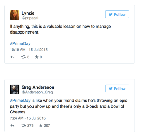
A few choice tweets on Amazon Prime Day
- Don’t over promise. If it truly is the biggest sale ever, say so. Then prove it. If it’s not- think of something else to say that reflects your reality. It doesn’t have to say, ‘BIG SALE: all the stuff left over that’s not selling and we need to get rid of’– it just has to be true.
- Do make it fun. Anthropology has a clever way to make further markdowns compelling- they’ve said, “Our sale is on sale”. That’s tempting. It doesn’t yell or scream, or promise rainbows and unicorns, but it does get my attention if I care about getting a great price, without sounding bargain-basement. Moo.com is having a sale- the homepage says only “SALE”, with a little 25% off dot whack and a fun little animated confetti gif. Simple- but effective.

It’s tempting for your writers to overstate to make something sound great- but it’s only great if you can deliver on it. You may get people in the door with a hyperbolic message, but if you’ve over promised, they’ll be less likely to respond to it next time.
The lesson in all of this? Put yourselves in the shoes of your shopper. How will the message make them feel? Are you telling them what they need to know to make a decision? Are you delivering on the promise? How will they feel after they experience it? Emotions drive action- whether they come back to you, or not. It’s up to you.

The car industry hasn’t progressed much online in the past 10 years. In the web-centric universe we live in, there’s a surprisingly high level of disfunction and disconnect in how car dealerships deal with web shoppers.
In a recent car search, I found that dealers treat online inquiries as an exception- the kind of exception that gets lost in the shuffle- with a generic, templated email response that doesn’t answer or acknowledge a very specific request, with follow ups from the general manager saying, “by now, I hope you’ve received the information you’ve requested, and here’s why you should shop at our world-class dealership” (when no info has been sent), and an almost complete inability to get specific questions answered via online or email.
They haven’t figured out how to accommodate the way shoppers want to interact. They’re sharing info with sites like Edmunds, but they’re not able to follow through on requests for information. They desperately need to. It would be so much easier for them to sell cars. And we’d all feel so much better about the experience.
I know I’ll do just about anything to avoid the painful haggling and eviscerating experience of negotiating to buy a car in the dealership. In fact, I won’t even step foot in a dealership without knowing exactly what their prices are & negotiating my deal in advance. By the time I go in to test drive and buy- I already know what I will pay, and who I’ll buy the car from.
Cars.com and Edmunds.com make it relatively easy to research pricing, availability and dealerships within a user-defined area. You can then select the dealers you want quotes from, and can add specific text to specify what you want. The process breaks down at the national and local dealer level. The generic form letters begin. Here’s an example, missing image and all:

You can see how helpful this was. My inquiry was for a specific make and model with specific lease terms and questions about availability. I got an ad for Mazda.
 On a national dealer site, there was a click-to-chat window, branded with a specific person’s name who was ready to help me right now. When I clicked it…I got an error message that ‘ended’ the conversation.

The conversations went equally well on the phone. Here, I was a directed shopper- ready to buy. Most dealerships I contacted lost the sale by losing track of the conversation- they all had an ‘internet specialist’, who typically returned the call a day or two later, when I’d already heard from someone else, or pursued and received the info I needed. It’s disappointing that it had to be so hard. On the flip side, It’s an amazing opportunity for dealerships to transform the business model and make this a stellar experience. They’d stand out.
In the end- one dealer stood out- they had what I wanted, and they didn’t waste my time. I wasn’t able to do it fully online- it did take a few calls. But the online screening did finally get me to the right dealer, the right price, and the right car. Painfully.
The point of all of this is- when it comes to having an online presence- don’t do it if you’re not going to do it right. A website is not a set it and forget it. It’s a living, breathing thing- and it will break if you don’t nurture it. You have to be all in. In this case, it looks like the car industry set it about 10 years ago, and hasn’t dealt with it since.


