Archive for

The car industry hasn’t progressed much online in the past 10 years. In the web-centric universe we live in, there’s a surprisingly high level of disfunction and disconnect in how car dealerships deal with web shoppers.
In a recent car search, I found that dealers treat online inquiries as an exception- the kind of exception that gets lost in the shuffle- with a generic, templated email response that doesn’t answer or acknowledge a very specific request, with follow ups from the general manager saying, “by now, I hope you’ve received the information you’ve requested, and here’s why you should shop at our world-class dealership” (when no info has been sent), and an almost complete inability to get specific questions answered via online or email.
They haven’t figured out how to accommodate the way shoppers want to interact. They’re sharing info with sites like Edmunds, but they’re not able to follow through on requests for information. They desperately need to. It would be so much easier for them to sell cars. And we’d all feel so much better about the experience.
I know I’ll do just about anything to avoid the painful haggling and eviscerating experience of negotiating to buy a car in the dealership. In fact, I won’t even step foot in a dealership without knowing exactly what their prices are & negotiating my deal in advance. By the time I go in to test drive and buy- I already know what I will pay, and who I’ll buy the car from.
Cars.com and Edmunds.com make it relatively easy to research pricing, availability and dealerships within a user-defined area. You can then select the dealers you want quotes from, and can add specific text to specify what you want. The process breaks down at the national and local dealer level. The generic form letters begin. Here’s an example, missing image and all:

You can see how helpful this was. My inquiry was for a specific make and model with specific lease terms and questions about availability. I got an ad for Mazda.
 On a national dealer site, there was a click-to-chat window, branded with a specific person’s name who was ready to help me right now. When I clicked it…I got an error message that ‘ended’ the conversation.

The conversations went equally well on the phone. Here, I was a directed shopper- ready to buy. Most dealerships I contacted lost the sale by losing track of the conversation- they all had an ‘internet specialist’, who typically returned the call a day or two later, when I’d already heard from someone else, or pursued and received the info I needed. It’s disappointing that it had to be so hard. On the flip side, It’s an amazing opportunity for dealerships to transform the business model and make this a stellar experience. They’d stand out.
In the end- one dealer stood out- they had what I wanted, and they didn’t waste my time. I wasn’t able to do it fully online- it did take a few calls. But the online screening did finally get me to the right dealer, the right price, and the right car. Painfully.
The point of all of this is- when it comes to having an online presence- don’t do it if you’re not going to do it right. A website is not a set it and forget it. It’s a living, breathing thing- and it will break if you don’t nurture it. You have to be all in. In this case, it looks like the car industry set it about 10 years ago, and hasn’t dealt with it since.
Does having content above the scroll matter anymore? We know that consumers will scroll to see what’s on the page when they’re shopping. But where should we draw the line when it comes to content? What standards should we be following?

Taking a look at a few popular content sites, it seems many publications value highlighting something visually compelling vs. the actual story that consumers are linking to. When a customer is linking from a headline to see a story, should we make them scroll to see what the ‘story’ is about? To even see the headline to confirm they’ve landed where they intended?
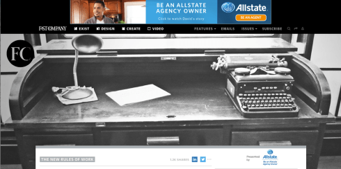
Above is the Fast Company homepage- and below, a landing page for a story. Would a consumer landing here have any idea what the lead story is going to be about? Have they given us any incentive to scroll? The key factor to consider when designing landing pages is to provide at minimum:
1. A visual confirmation that I’m landing where I’ve intended.
2. Enough content above the scroll to generate the consumer’s interest and curiosity to keep going.

Interestingly, Fast Company’s mobile experience is much better- I can see the headline above the scroll. This is perfect.
Let’s take a look at TechCrunch. In this case, we have an image that relates specifically to the story (vs. Fast Co’s more esoteric images), and 2+ story leads above the scroll. This may be less dramatic visually- but it gets me to the stories.

Below is the landing page for a specific story on TechCrunch. I can’t see the story, but I do, at least get the headline I clicked on, to validate I’m in the right place.

The key consideration is: what are you trying to do? What do you want the consumer to do when they land on the page? What do you want people to remember you for? If it is about the story, Tech Crunch is doing a better job here. I can at least see the headline that enticed me in the first place.
Fast Company, in designing for online, is making the decision (whether intentional or not), that the photography is the most important thing they want consumers to see. As a consumer, it makes me nuts that I can’t see the story- or even the headline, above the scroll. Not on my laptop, nor my 22″ monitor- though the experience on the iPhone is much better. As a consumer, I like having a meaningful image, but find it irritating when I’ve clicked on a link from Facebook or Linkedin to land on a page where that’s all I see. I clicked because I was interested in the story.
Just give me the story.


