Does having content above the scroll matter anymore? We know that consumers will scroll to see what’s on the page when they’re shopping. But where should we draw the line when it comes to content? What standards should we be following?

Taking a look at a few popular content sites, it seems many publications value highlighting something visually compelling vs. the actual story that consumers are linking to. When a customer is linking from a headline to see a story, should we make them scroll to see what the ‘story’ is about? To even see the headline to confirm they’ve landed where they intended?
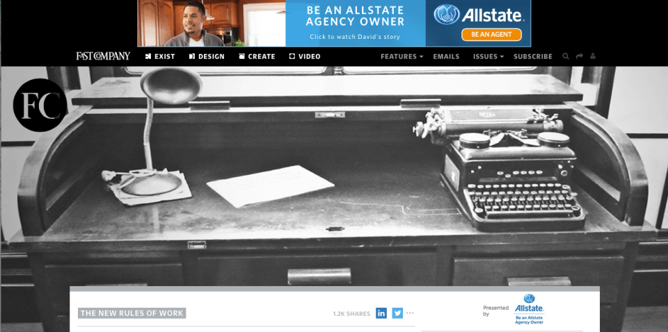
Above is the Fast Company homepage- and below, a landing page for a story. Would a consumer landing here have any idea what the lead story is going to be about? Have they given us any incentive to scroll? The key factor to consider when designing landing pages is to provide at minimum:
1. A visual confirmation that I’m landing where I’ve intended.
2. Enough content above the scroll to generate the consumer’s interest and curiosity to keep going.

Interestingly, Fast Company’s mobile experience is much better- I can see the headline above the scroll. This is perfect.
Let’s take a look at TechCrunch. In this case, we have an image that relates specifically to the story (vs. Fast Co’s more esoteric images), and 2+ story leads above the scroll. This may be less dramatic visually- but it gets me to the stories.

Below is the landing page for a specific story on TechCrunch. I can’t see the story, but I do, at least get the headline I clicked on, to validate I’m in the right place.

The key consideration is: what are you trying to do? What do you want the consumer to do when they land on the page? What do you want people to remember you for? If it is about the story, Tech Crunch is doing a better job here. I can at least see the headline that enticed me in the first place.
Fast Company, in designing for online, is making the decision (whether intentional or not), that the photography is the most important thing they want consumers to see. As a consumer, it makes me nuts that I can’t see the story- or even the headline, above the scroll. Not on my laptop, nor my 22″ monitor- though the experience on the iPhone is much better. As a consumer, I like having a meaningful image, but find it irritating when I’ve clicked on a link from Facebook or Linkedin to land on a page where that’s all I see. I clicked because I was interested in the story.
Just give me the story.


