Posts from the ‘user experience’ Category
After a round of meeting great new vendors, exploring cool new tools & tech, I always think about how much room my clients have in my budget for these fun, experimental things. We’re all attracted to fun, shiny things. But as business leaders, are these always the panacea we want them to be? When we’re thinking about how to allocate precious budget $ to improving our websites, there’s push-and-pull between the foundational and the fun.
There are always new tools that promise better engagement, conversion or order value. Innovations that will increase brand value and improve the customer experience. Some of these are truly a value add.
But what good is a fun or beautiful front-end, if the underlying experience is bad?
The same is true in our personal lives. That shiny new buy isn’t going to change your life, though it may make you feel great in the moment. When the excitement wears off, you still have the same issues to deal with.
Last summer, I was planning a few home renovation projects. Not my favorite thing to do, but I love the result. It’s so much work: the planning, the product, color, and materials. The contractors. The coordination and disruption. Whenever we’ve talked about these bigger projects, I joke that I’d rather buy a new house that someone else already fixed up.
After two years of work-from-home, and daily visibility to the deficiencies of our laundry room, the main entry to the house from the garage, I was ready. Picture old, low-quality cabinets peeling at the edges, no longer flush, unpleasantly aged beige particleboard- yuck. It was dated, ugly and in disrepair. Our downstairs bathroom also needed an upgrade- tiles that keep pushing out the caulk, ugly striped wall-paper, and out-of-date everything.
But then while gardening out back, we noticed a deep foundation crack. One that used to be a hairline. The crack extended 15 feet, and was big enough that you could see sunlight from inside our furnace room, and feel outside air if you put your hand up to it.
For context, we live on a hill that descends into a creek. To protect the house, it’s a constant fight to keep erosion at bay. And after 25 years, the house was showing the wear.
We had to deal with it.
So we fixed the wall. It took 4 weeks of back-hoes, concrete destruction and reconstruction, leaving deep trenches through our back-yard and dust everywhere. During the tear-down, they told us that moving our old A/C units was a risk. Since they were ancient, decrepit, and inefficient, they recommended we buy new. They couldn’t guarantee that they would work if disconnected, moved and reconnected. But in light of the fortune we were investing in the foundation, we had little appetite for replacing those NOW. Let them hang on for one more summer.
When the work was finished, neither of the A/C units could be saved. One had been dropped. The other needed repairs so expensive, it wasn’t worth doing. So now, two days before the first 95 degree weekend of the year, we needed new A/C units. That was fun.
All in, we spent $20K on the foundation, then another $12K or so on the A/C’s. My renovation budget was gone- and then some. I really wanted that updated entry for the house. We were going to tear out a closet and make a more modern mud-room with a bench. And nicer downstairs bathroom.
But what good is a beautiful entryway to the house, if the house might slide into the creek? When we try to sell the house, what’s going to drive more value? A solid foundation, or a nicer mud-room? Shoppers might love what they see walking through and make the offer, but when the inspection is done- the foundational issues come to light, and many shoppers opt to simply back-out.
The same thing happens on your website.
Consider this as you plan your commerce & technology budgets. If you keep investing primarily on the superficial- the entry-ways, the cosmetic and feel-good moments, your technical debt gets bigger and bigger over time. Eventually, you’ll feel the pain. Conversion will stay flat or down. Only your most loyal or sale-conscious customers will persist.
We all love a little bit of fun. Branding matters. But customer experience is everything, from the beginning to the end. If a shopper loves shopping your product, but has trouble signing-in or checking out, your brand value takes a negative turn.
If your underlying foundation is cracked, all that good will just opts out.
A few key things you need to know about improving site conversion:
- It’s about what NOT to do, as much as it is about what TO do.
- You have to know who you are (as a brand), and what your customer wants.
- You give it to them.
Sound simple? It is. Some of the most fundamental things you can do to improve conversion are the simplest. And yet, so many brands are missing out on fixing these key friction points in the shopping process. Here are the five key areas of focus you should get right before you consider anything else:
1. Navigation: This is where you need to take off your marketing hat, and put on your customer’s. Shop your own site. Make sure everyone on your team is doing it. Get feedback from everyone- especially real customers. A few must haves for your checklist:
- A prominent search box, with predictive results.
- Top navigation categories that are easy for a new customer to understand.
- Refinements and filters, to allow a customer to quickly drill down to what they want.
- Inspiration, by way of content, new products and/or solutions on your homepage to inspire the ‘browsing’ shopper .
2. Site speed: If your site is slow, it will hurt performance both from a conversion perspective (high bounce & exit rates), and from an organic perspective- a slow load time will affect your Google ranking, especially if your site is slow on mobile. A few checkpoints:
- Check your mobile site speed using Google’s free tool, here. It will tell you your average load time for mobile- and your estimated visitor loss based on load time. Now see how your competitors stack up.
- Use your analytics tools to see page load time for key landing pages, and look at your top exit pages. This will give you some priorities for where to start.
- Work with your developers to optimize clunky code, pixels and functionality to improve.
3. Product info: There’s a time and place for everything. Provide the right info, in the right steps along the shopping path, to enable the next click. A few for your checklist:
- Crisp images, with zoom and alternate views.
- Thorough product descriptions, with practical info about how to wear, how it fits, how to choose a size, how to use and care for.
- Links to ‘live chat’ and ‘shipping’ info.
- Price: clear sale or promo info.
- Prompts to remind customer of value-propositions that will inspire confidence, i.e. “Fast, free shipping” or “Our guarantee” or “Easy returns”.
4. Shipping: Free and fast. Don’t give your customers a reason to buy it on Amazon. Enough said.
5. Checkout: Don’t get in your own way. Take a look at the metrics around your shopping funnel to see which pages of checkout are seeing the most attrition. Consider:
- Clear, uncluttered first page of checkout that offers Guest Checkout as well as Registered user checkout.
- Mobile payments: if the customer has to get out their wallet while shopping on a mobile device- you’ll lose momentum- and potentially the sale.
- Standard, fast, and faster delivery options showing cost and expected delivery dates.
- A minimum of interference- don’t get in the way of a customer’s intent to checkout. If you’re up-selling services or products- keep it simple, and keep it outside of the customer’s focused path.
Keeping your shopping path frictionless will take on-going care and vigilance. If you’re highly focused on these, you’ll be more likely to capture new customer sales- and less likely to annoy your loyal repeat customers. The rewards are great- for everyone. Improving the shopping experience will always serve you, and your customers well.
Does having content above the scroll matter anymore? We know that consumers will scroll to see what’s on the page when they’re shopping. But where should we draw the line when it comes to content? What standards should we be following?
Taking a look at a few popular content sites, it seems many publications value highlighting something visually compelling vs. the actual story that consumers are linking to. When a customer is linking from a headline to see a story, should we make them scroll to see what the ‘story’ is about? To even see the headline to confirm they’ve landed where they intended?
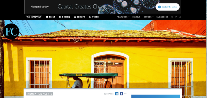
Above is the Fast Company homepage- and below, a landing page for a story. Would a consumer landing here have any idea what the lead story is going to be about? Have they given us any incentive to scroll? The key factor to consider when designing landing pages is to provide at minimum:
1. A visual confirmation that I’m landing where I’ve intended.
2. Enough content above the scroll to generate the consumer’s interest and curiosity to keep going.

Interestingly, Fast Company’s mobile experience is much better- I can see the headline above the scroll. This is perfect.
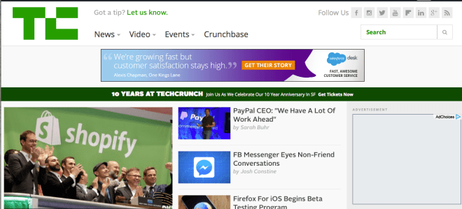
Let’s take a look at TechCrunch. In this case, we have an image that relates specifically to the story (vs. Fast Co’s more esoteric images), and 2+ story leads above the scroll. This may be less dramatic visually- but it gets me to the stories.
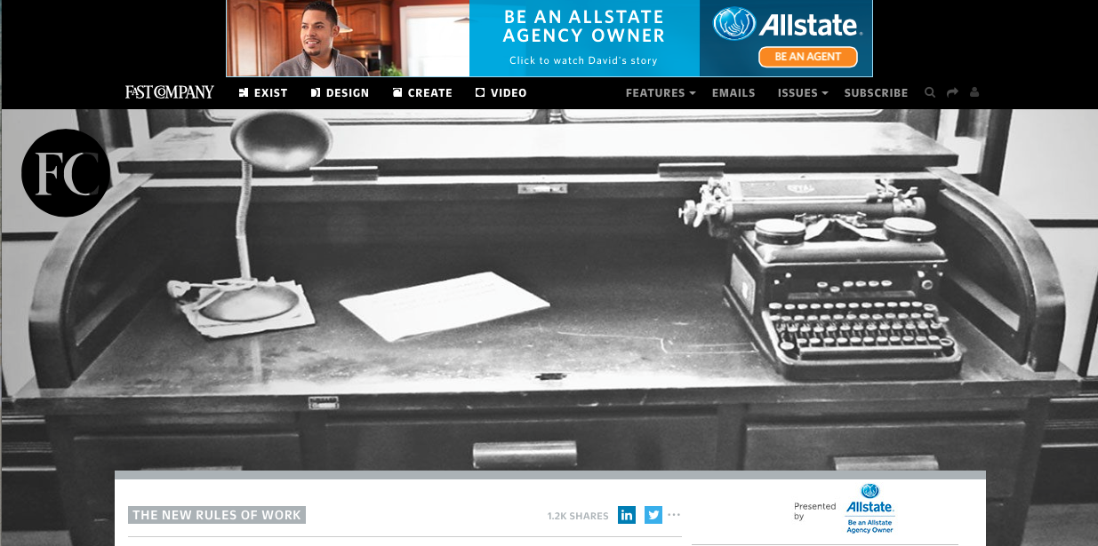
Below is the landing page for a specific story on TechCrunch. I can’t see the story, but I do, at least get the headline I clicked on, to validate I’m in the right place.
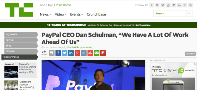
The key consideration is: what are you trying to do? What do you want the consumer to do when they land on the page? What do you want people to remember you for? If it is about the story, Tech Crunch is doing a better job here. I can at least see the headline that enticed me in the first place.
Fast Company, in designing for online, is making the decision (whether intentional or not), that the photography is the most important thing they want consumers to see. As a consumer, it makes me nuts that I can’t see the story- or even the headline, above the scroll. Not on my laptop, nor my 22″ monitor- though the experience on the iPhone is much better. As a consumer, I like having a meaningful image, but find it irritating when I’ve clicked on a link from Facebook or Linkedin to land on a page where that’s all I see. I clicked because I was interested in the story.
Just give me the story.


