Posts from the ‘customer experience’ Category
After a round of meeting great new vendors, exploring cool new tools & tech, I always think about how much room my clients have in my budget for these fun, experimental things. We’re all attracted to fun, shiny things. But as business leaders, are these always the panacea we want them to be? When we’re thinking about how to allocate precious budget $ to improving our websites, there’s push-and-pull between the foundational and the fun.
There are always new tools that promise better engagement, conversion or order value. Innovations that will increase brand value and improve the customer experience. Some of these are truly a value add.
But what good is a fun or beautiful front-end, if the underlying experience is bad?
The same is true in our personal lives. That shiny new buy isn’t going to change your life, though it may make you feel great in the moment. When the excitement wears off, you still have the same issues to deal with.
Last summer, I was planning a few home renovation projects. Not my favorite thing to do, but I love the result. It’s so much work: the planning, the product, color, and materials. The contractors. The coordination and disruption. Whenever we’ve talked about these bigger projects, I joke that I’d rather buy a new house that someone else already fixed up.
After two years of work-from-home, and daily visibility to the deficiencies of our laundry room, the main entry to the house from the garage, I was ready. Picture old, low-quality cabinets peeling at the edges, no longer flush, unpleasantly aged beige particleboard- yuck. It was dated, ugly and in disrepair. Our downstairs bathroom also needed an upgrade- tiles that keep pushing out the caulk, ugly striped wall-paper, and out-of-date everything.
But then while gardening out back, we noticed a deep foundation crack. One that used to be a hairline. The crack extended 15 feet, and was big enough that you could see sunlight from inside our furnace room, and feel outside air if you put your hand up to it.
For context, we live on a hill that descends into a creek. To protect the house, it’s a constant fight to keep erosion at bay. And after 25 years, the house was showing the wear.
We had to deal with it.
So we fixed the wall. It took 4 weeks of back-hoes, concrete destruction and reconstruction, leaving deep trenches through our back-yard and dust everywhere. During the tear-down, they told us that moving our old A/C units was a risk. Since they were ancient, decrepit, and inefficient, they recommended we buy new. They couldn’t guarantee that they would work if disconnected, moved and reconnected. But in light of the fortune we were investing in the foundation, we had little appetite for replacing those NOW. Let them hang on for one more summer.
When the work was finished, neither of the A/C units could be saved. One had been dropped. The other needed repairs so expensive, it wasn’t worth doing. So now, two days before the first 95 degree weekend of the year, we needed new A/C units. That was fun.
All in, we spent $20K on the foundation, then another $12K or so on the A/C’s. My renovation budget was gone- and then some. I really wanted that updated entry for the house. We were going to tear out a closet and make a more modern mud-room with a bench. And nicer downstairs bathroom.
But what good is a beautiful entryway to the house, if the house might slide into the creek? When we try to sell the house, what’s going to drive more value? A solid foundation, or a nicer mud-room? Shoppers might love what they see walking through and make the offer, but when the inspection is done- the foundational issues come to light, and many shoppers opt to simply back-out.
The same thing happens on your website.
Consider this as you plan your commerce & technology budgets. If you keep investing primarily on the superficial- the entry-ways, the cosmetic and feel-good moments, your technical debt gets bigger and bigger over time. Eventually, you’ll feel the pain. Conversion will stay flat or down. Only your most loyal or sale-conscious customers will persist.
We all love a little bit of fun. Branding matters. But customer experience is everything, from the beginning to the end. If a shopper loves shopping your product, but has trouble signing-in or checking out, your brand value takes a negative turn.
If your underlying foundation is cracked, all that good will just opts out.

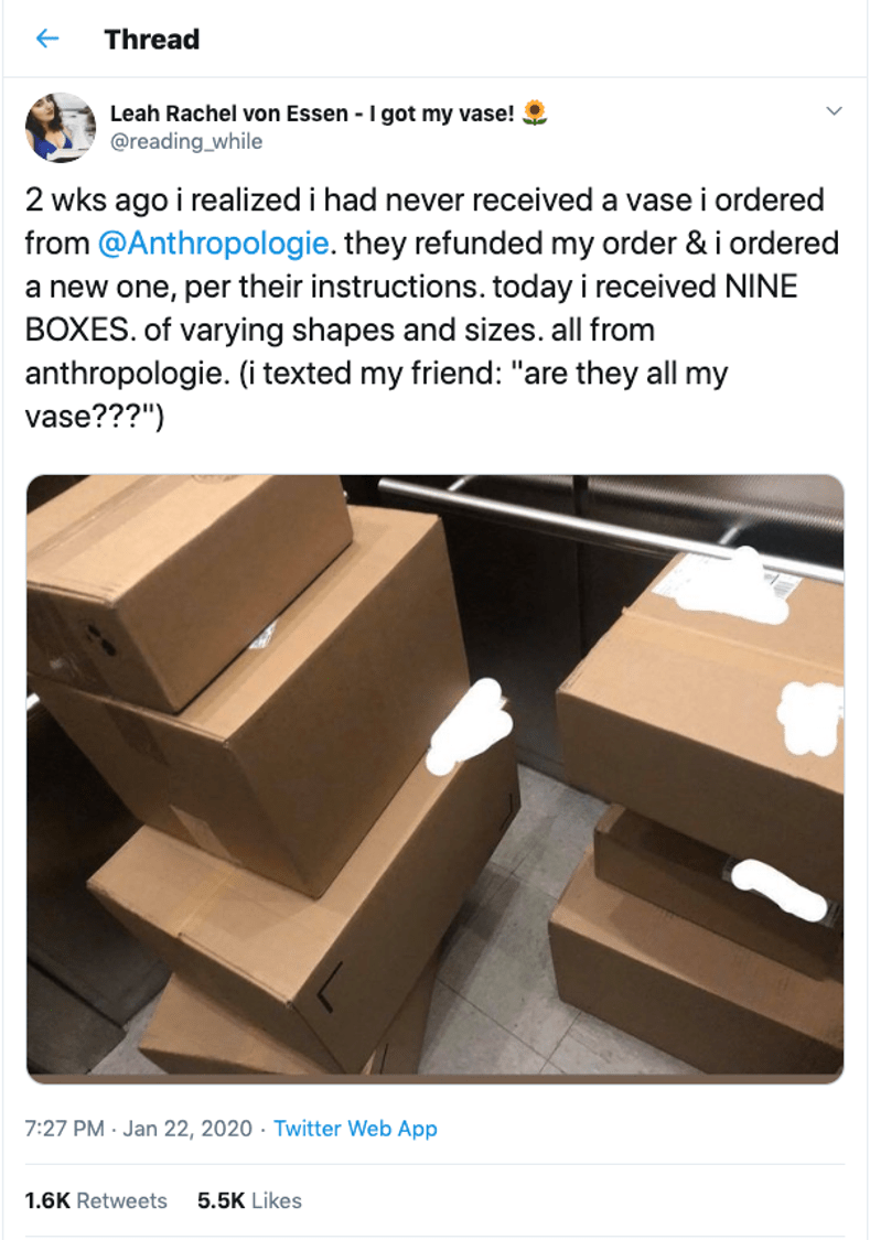
Last week, Anthropologie had what can only be described as every brand’s worst nightmare- a delivery snafu that went viral on twitter, first as an amusing story- and then as a customer experience gone terribly wrong, when Anthro’s response devolved from amused and supportive, to unreasonable and threatening- the antithesis of a good customer experience.
Leah Rachel von Essen, posting as @reading_while on twitter, shared her story about the vase that never arrived, and her resulting re-order. Instead of delivering the vase, Anthropologie shipped her 9 huge boxes of unrelated products, including a 20 lb candle, a feather coat, and a strange golden hand. And then demanded she return them all- or risk being banned and billed for the merchandise she hadn’t ordered- and didn’t want.
Had they handled it well, this could have been a great customer experience and a social media win for Anthro. Instead, one mis-directed social media post later, they quickly turned it into a cautionary tale about how NOT to respond to a brand snafu online- quickly going viral on twitter, resulting in thousands of supporters, including a lawyer offering to intervene on Leah’s behalf, and getting picked up by Forbes, as This is The Best Retail Story You’ll Read all week. And indeed, it was.
The moral of the story is: every single interaction with your customers matters. And every single employee of the brand is a brand ambassador with the capacity to help, or hurt the brand’s reputation. Every interaction. Every customer. Make sure that your people know this, and are empowered to do the right thing. In the end- Anthropologie did the right thing. But the damage was done.
It’s worth reading the entire thread.
Leah is a book reviewer and blogger, who made this story such epic fun on twitter. You can see more of her writing on While Reading and Walking
A few key things you need to know about improving site conversion:
- It’s about what NOT to do, as much as it is about what TO do.
- You have to know who you are (as a brand), and what your customer wants.
- You give it to them.
Sound simple? It is. Some of the most fundamental things you can do to improve conversion are the simplest. And yet, so many brands are missing out on fixing these key friction points in the shopping process. Here are the five key areas of focus you should get right before you consider anything else:
1. Navigation: This is where you need to take off your marketing hat, and put on your customer’s. Shop your own site. Make sure everyone on your team is doing it. Get feedback from everyone- especially real customers. A few must haves for your checklist:
- A prominent search box, with predictive results.
- Top navigation categories that are easy for a new customer to understand.
- Refinements and filters, to allow a customer to quickly drill down to what they want.
- Inspiration, by way of content, new products and/or solutions on your homepage to inspire the ‘browsing’ shopper .
2. Site speed: If your site is slow, it will hurt performance both from a conversion perspective (high bounce & exit rates), and from an organic perspective- a slow load time will affect your Google ranking, especially if your site is slow on mobile. A few checkpoints:
- Check your mobile site speed using Google’s free tool, here. It will tell you your average load time for mobile- and your estimated visitor loss based on load time. Now see how your competitors stack up.
- Use your analytics tools to see page load time for key landing pages, and look at your top exit pages. This will give you some priorities for where to start.
- Work with your developers to optimize clunky code, pixels and functionality to improve.
3. Product info: There’s a time and place for everything. Provide the right info, in the right steps along the shopping path, to enable the next click. A few for your checklist:
- Crisp images, with zoom and alternate views.
- Thorough product descriptions, with practical info about how to wear, how it fits, how to choose a size, how to use and care for.
- Links to ‘live chat’ and ‘shipping’ info.
- Price: clear sale or promo info.
- Prompts to remind customer of value-propositions that will inspire confidence, i.e. “Fast, free shipping” or “Our guarantee” or “Easy returns”.
4. Shipping: Free and fast. Don’t give your customers a reason to buy it on Amazon. Enough said.
5. Checkout: Don’t get in your own way. Take a look at the metrics around your shopping funnel to see which pages of checkout are seeing the most attrition. Consider:
- Clear, uncluttered first page of checkout that offers Guest Checkout as well as Registered user checkout.
- Mobile payments: if the customer has to get out their wallet while shopping on a mobile device- you’ll lose momentum- and potentially the sale.
- Standard, fast, and faster delivery options showing cost and expected delivery dates.
- A minimum of interference- don’t get in the way of a customer’s intent to checkout. If you’re up-selling services or products- keep it simple, and keep it outside of the customer’s focused path.
Keeping your shopping path frictionless will take on-going care and vigilance. If you’re highly focused on these, you’ll be more likely to capture new customer sales- and less likely to annoy your loyal repeat customers. The rewards are great- for everyone. Improving the shopping experience will always serve you, and your customers well.
Grocery delivery services are an absolute lifesaver when you just don’t have the time to get to the store. It is amazing what you can get delivered to your door: prepared foods that are actually good, meal kits, fresh produce, and anything you need for the pantry.
Early this year, I was living in a different city during the week, and coming home just for the weekend. I was beyond exhausted, from the driving, the working, trying to keep two places in order and living out of a suitcase. During these months, I tried all the online grocery options available to me: Amazon Fresh, Fresh Direct, and Shoprite. They all have their pros and cons, but overall, the state of online grocery shopping is not where it needs to be to make it my go-to during normal times. Not yet.
On the positive side, I no longer have to lug heavy water bottles, dog food or mega packs of paper towels and toilet paper from the grocery store. It’s Amazon Prime, all the way. I am very happy not to have had to visit a pet store in over a year.
Below are my ratings for Amazon Prime, Fresh Direct and Shoprite, across 6 key areas.
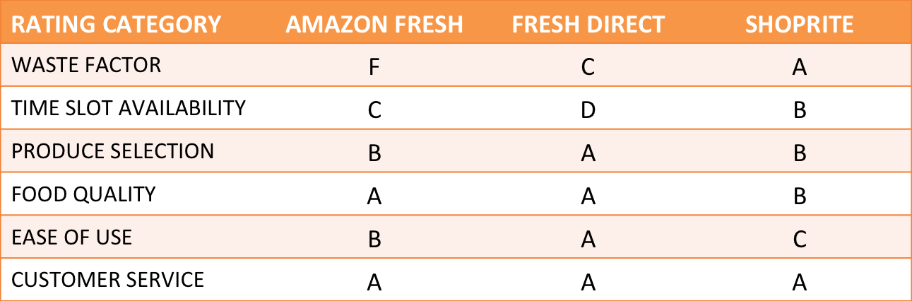
The waste factor
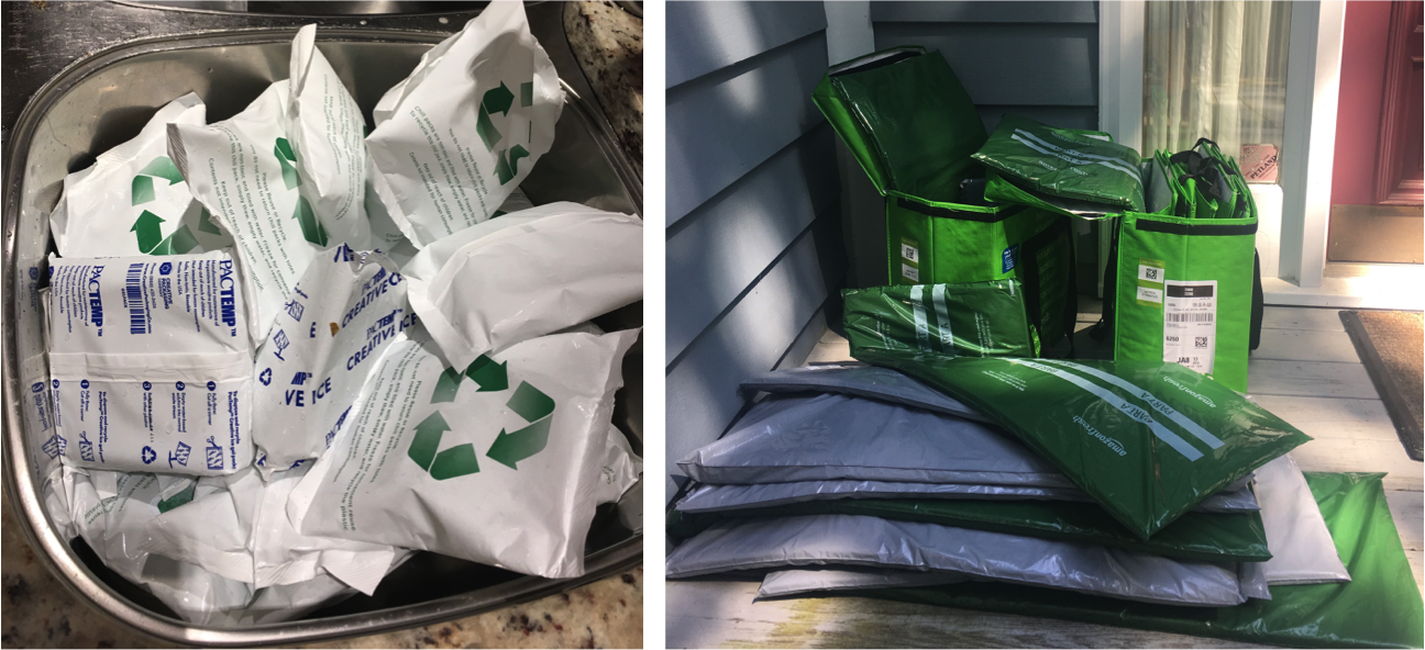
Amazon gets the F in this category. My last delivery came in huge insulated totes that were ridiculously under packed, and filled with excessive amounts of padding, cold packs, and dry ice (which burns if you touch it, as I found). It took me over 40 minutes to break the totes down- they are filled with hard sided padded panels to keep them sturdy, as well as bags and bags of dry ice and ice packs, all of which have to go in the sink to melt before you can empty them. When I had completely emptied the bags- my sink was full to the top with these packets. It was a ludicrous amount of waste. And worse, they’d sent an excessive number of totes. Three of them had only a product or two inside- with all that padding and cold packs on top. One had a single bag of frozen peas in it. Another had a bunch of asparagus. In another tote, they’d packed heavy 12 packs of drinks on top of cereal boxes, crushing them. When I called in about this, Amazon said that machines pack the bags, so sometimes the logic is a bit off. I’ll say. Below, a few images of the debris.
After this debacle, I actually called to ask Amazon to cancel my Fresh membership.
Fresh Direct uses cardboard boxes- bulky, but easy enough to break down and recycle. Shoprite gets the A for using regular grocery bags without any excess packaging.
Time slot availability
This is one of my pet peeves with all of them. I learned the hard way to check for delivery slots before spending the time to fill my cart. To achieve true convenience, these services need to make quicker delivery available, and more time slots available in general in the near term. The true convenience would be to realize on Friday or Saturday that I don’t have time to shop, and to be able to get a slot for the next day. In reality- the best case scenario on a Friday is to get a Sunday 8-10pm delivery slot. You really have to think ahead, which isn’t always possible- and if you’re out of food for the weekend, it doesn’t help. On the upside, if you do plan ahead- you can set a time slot by putting anything in your cart ahead of time, and then you’re given until a certain time the night before (11pm with Fresh Direct) to modify the order. Unfortunately, it’s not always possible to anticipate running out of time to get to the store. If these services could do same day or next day delivery on demand, that would be the A+.
Produce selection
Fresh Direct was the best on this. I never had to throw anything out. Sometimes I would get something a bit unripe, but it was never too far gone. With both Amazon and Shoprite, I’d actually have to throw things away or call them to get credited for bad produce. Not terrible, most of the time, but not consistently great, either.
Food quality
Aside from produce and meat, for the most part, they’re all good here. Fresh Direct is the one I’m most comfortable ordering meat from, and they have by far the best prepared food options. I wasn’t impressed with Amazon’s- and the options weren’t great- often, the meat wouldn’t be available for the delivery slot. Shoprite’s was consistently ok. I find if I ask for the organic, it’s always best, vs. leaving the choice to them.
Ease of use
Fresh Direct is the clear winner for ease of shopping. The navigation is clear and easy to use, the search is great, and best yet- I can fill my cart with the items from my last order and edit from there. Amazon’s navigation and search were good, but it always took me longer. Shoprite’s was terrible- every time I went to the site, I’d have to work at just finding my local Shoprite location to order from- it never remembered me. And they don’t deliver in my area-they shop, but you have to pick it up.
Customer Service
When something goes wrong- they are all responsive and customer centric- quick to credit you if something wasn’t good or right. Amazon went the extra mile, and put $ in my account as an appeasement when I called to complain about the ridiculous packaging and crushed groceries. The agents were always quick to answer, friendly, and accommodating.
So what’s next?
Ideally, online grocers will scale to accept orders on a shorter delivery window- this is what they need to do to make it a true convenience, and what’s needed to make customers like me return again and again. I don’t trust them to be there for me when I need them, because I can never get the time slot I want. This is the key reason I don’t use them except when I absolutely can’t get to the store. With Amazon’s purchase of Whole Foods, I’m hopeful they will find a way to deliver locally more easily, directly from Whole Foods- competing with Fresh Direct on quality, and beating them on speed to home. I would also like to see them get more efficient with the packaging. To become my go-to, it can’t be a project to unpack and break down packaging and recycling. I don’t want to create that much waste, and hopefully they don’t either. Online grocery shopping is one of the most amazing conveniences of online retail, but there’s work to be done to get it right.
Everyone’s talking about the death of retail, and what’s next for eCommerce: AI, IOT, and so on. This, combined with today’s more brand agnostic customer, is enough to make a retailer despair. But let’s face it- people are still shopping. Retailers need to up their game to stay in it- and to avoid being eaten alive by Amazon.
While there are so many epic things on the horizon to do- there’s one fundamental opportunity that most online retailers haven’t figured out yet, and hardly anyone is talking about: immediate gratification. The impulse purchase. If we can figure out how to make that easier, faster and better- we’ll have something.
Apple pay is a step in the right direction- it makes it easy to buy from a compelling email in about two seconds. The first part of the impulse buy is there- but I still have to wait for that package to arrive.
Amazon has us all trained to expect 1-2 day delivery on everything. Forget paper towels at the grocery store on Sunday? Amazon can have those to you by Tuesday. Most retailers have followed suit with at least free standard shipping. But anything that takes 3-5 days is like waiting an eternity. I find myself thinking- didn’t I order that WEEKS ago? The new standard is fast. If I could have gone to a store to get it by now, it’s taking too long. But what if I want it today, and don’t have time to go to a store?
Back in the internet boom- Urban Fetch was a great start-up in NYC that would deliver anything within an hour- bagels from your favorite place, the book you need for your daughter’s English class by tomorrow that she forgot to tell you about…a present for a baby shower, etc. It was the best thing ever. But they didn’t survive- it just wasn’t cost effective. It’s surprising in all this time, that no one has figured out how to do this at scale for fashion- it exists for food- Seamless, Instacart, Uber-eats. But not for fashion.
If stores, every major brand, including department stores, could figure out how to deliver same day- within hours, this would create a huge paradigm shift for shoppers. Fashion brands need to be looking at how to facilitate this & stock the stores for it. If I have to go home, and think about it, or wait for it- I might change my mind. Yeah- it’s online in the end, but the stores become local points of distribution.
Everlane has it right: in NYC, they’ll deliver within an hour. BAM. I need a raincoat or a new bag? Instant gratification in 5 minutes of browsing on my phone. But who else? Even with online groceries, I have to set my delivery window 48 hours out (more on that in a future post). The model here has to change.
On a recent trip to the mall, I experienced the worst of mall madness- it was the day before Father’s Day, and it was mobbed. Every store was a mess- like Macy’s the week before Christmas. Even shopping in Nordstrom was so unpleasant, I couldn’t begin to find anything good, because the tables were a mess- it looked so junky and worked-through. I wasn’t shopping for Father’s Day, thankfully- so was able to bail, and just shop online without the stress.
Will people still go to stores? Sure. There will always be those last-minute shoppers, and the delight of discovery- finding something you weren’t looking for & didn’t know you needed ’til you stumbled across it. But stores need to get more creative about making the experience of shopping worth that effort. Burlington, VT is a great example of this- Church street is closed to traffic, and filled with retailers and restaurants- making it a great place to shop, eat, meander and discover. The nearby mall is empty. Malls are becoming a depressing and uninspired destination. But that’s a story lots of others are already telling.
For the time-being, people will continue to be pressed for last-minute shopping, and until online retailers can figure out how to deliver same day, those shoppers are going to the mall.

The car industry hasn’t progressed much online in the past 10 years. In the web-centric universe we live in, there’s a surprisingly high level of disfunction and disconnect in how car dealerships deal with web shoppers.
In a recent car search, I found that dealers treat online inquiries as an exception- the kind of exception that gets lost in the shuffle- with a generic, templated email response that doesn’t answer or acknowledge a very specific request, with follow ups from the general manager saying, “by now, I hope you’ve received the information you’ve requested, and here’s why you should shop at our world-class dealership” (when no info has been sent), and an almost complete inability to get specific questions answered via online or email.
They haven’t figured out how to accommodate the way shoppers want to interact. They’re sharing info with sites like Edmunds, but they’re not able to follow through on requests for information. They desperately need to. It would be so much easier for them to sell cars. And we’d all feel so much better about the experience.
I know I’ll do just about anything to avoid the painful haggling and eviscerating experience of negotiating to buy a car in the dealership. In fact, I won’t even step foot in a dealership without knowing exactly what their prices are & negotiating my deal in advance. By the time I go in to test drive and buy- I already know what I will pay, and who I’ll buy the car from.
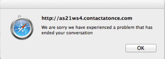
Cars.com and Edmunds.com make it relatively easy to research pricing, availability and dealerships within a user-defined area. You can then select the dealers you want quotes from, and can add specific text to specify what you want. The process breaks down at the national and local dealer level. The generic form letters begin. Here’s an example, missing image and all:
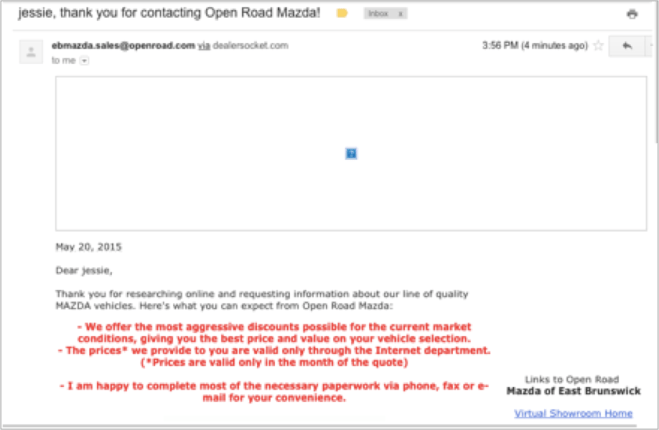
You can see how helpful this was. My inquiry was for a specific make and model with specific lease terms and questions about availability. I got an ad for Mazda.
 On a national dealer site, there was a click-to-chat window, branded with a specific person’s name who was ready to help me right now. When I clicked it…I got an error message that ‘ended’ the conversation.
The conversations went equally well on the phone. Here, I was a directed shopper- ready to buy. Most dealerships I contacted lost the sale by losing track of the conversation- they all had an ‘internet specialist’, who typically returned the call a day or two later, when I’d already heard from someone else, or pursued and received the info I needed. It’s disappointing that it had to be so hard. On the flip side, It’s an amazing opportunity for dealerships to transform the business model and make this a stellar experience. They’d stand out.
In the end- one dealer stood out- they had what I wanted, and they didn’t waste my time. I wasn’t able to do it fully online- it did take a few calls. But the online screening did finally get me to the right dealer, the right price, and the right car. Painfully.
The point of all of this is- when it comes to having an online presence- don’t do it if you’re not going to do it right. A website is not a set it and forget it. It’s a living, breathing thing- and it will break if you don’t nurture it. You have to be all in. In this case, it looks like the car industry set it about 10 years ago, and hasn’t dealt with it since.
Does having content above the scroll matter anymore? We know that consumers will scroll to see what’s on the page when they’re shopping. But where should we draw the line when it comes to content? What standards should we be following?
Taking a look at a few popular content sites, it seems many publications value highlighting something visually compelling vs. the actual story that consumers are linking to. When a customer is linking from a headline to see a story, should we make them scroll to see what the ‘story’ is about? To even see the headline to confirm they’ve landed where they intended?
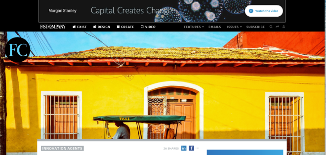
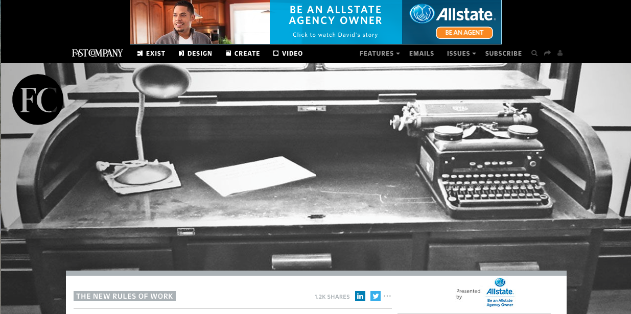
Above is the Fast Company homepage- and below, a landing page for a story. Would a consumer landing here have any idea what the lead story is going to be about? Have they given us any incentive to scroll? The key factor to consider when designing landing pages is to provide at minimum:
1. A visual confirmation that I’m landing where I’ve intended.
2. Enough content above the scroll to generate the consumer’s interest and curiosity to keep going.

Interestingly, Fast Company’s mobile experience is much better- I can see the headline above the scroll. This is perfect.
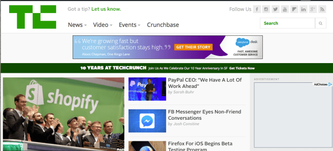
Let’s take a look at TechCrunch. In this case, we have an image that relates specifically to the story (vs. Fast Co’s more esoteric images), and 2+ story leads above the scroll. This may be less dramatic visually- but it gets me to the stories.
Below is the landing page for a specific story on TechCrunch. I can’t see the story, but I do, at least get the headline I clicked on, to validate I’m in the right place.
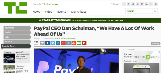
The key consideration is: what are you trying to do? What do you want the consumer to do when they land on the page? What do you want people to remember you for? If it is about the story, Tech Crunch is doing a better job here. I can at least see the headline that enticed me in the first place.
Fast Company, in designing for online, is making the decision (whether intentional or not), that the photography is the most important thing they want consumers to see. As a consumer, it makes me nuts that I can’t see the story- or even the headline, above the scroll. Not on my laptop, nor my 22″ monitor- though the experience on the iPhone is much better. As a consumer, I like having a meaningful image, but find it irritating when I’ve clicked on a link from Facebook or Linkedin to land on a page where that’s all I see. I clicked because I was interested in the story.
Just give me the story.
There is such a thing as overdoing your video content. When there’s a message I could just as easily (or more easily) scan via text- just give me the text. I can’t even count how many times I’ve clicked on an interesting link from Facebook, Linkedin or news media sites only to find that it’s a video link, and I can’t get to the content of the message unless I’m willing to wait through the ad, then sit through the video.
Video has it’s place- for entertainment, or education. But for news or content, give me text. I don’t want to have to go through it at a video’s pace- I want to see what it’s about and quickly move on.
What’s the best practice?
First, your link or image should clearly show that it’s a video- or you’re misleading me.
Second- provide the text transcript as an option.
Let the user have control over the experience.
Sounds simple, doesn’t it? If you add functionality to your site, you have to know what the customer expectation will be- and deliver on it. Getting it ALMOST right is the same as getting it wrong.
Here’s an example: one day, I was shopping on one of my favorite flash-sale sites- amazing brands and products at unusually great deals. What’s not to love? But there are so many items, and I have limited time and patience. That’s why I was so glad to see a refine-by-size feature that allows me to sort by just the product that would work for me- good! That’s a best practice, especially for a sale in which quantities are limited.
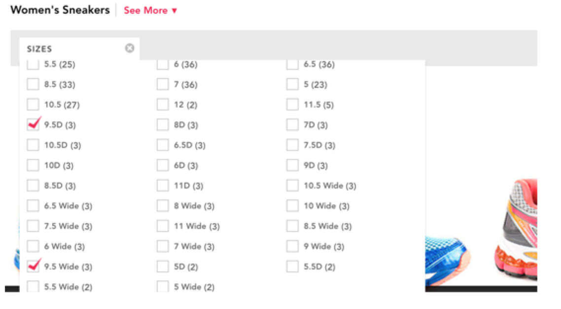
Refine by size feature- a best practice.
The rub? When the refine-by-size feature doesn’t deliver real-time information, it’s worse than having no refinements at all- because you’ve set my expectations for a personalized result, but then let me down on the delivery. Advice? Turn the refinements off until you can get it right. It’s not a value-add if it’s only right sometimes (like a faulty clock: it’s right at LEAST twice a day…).
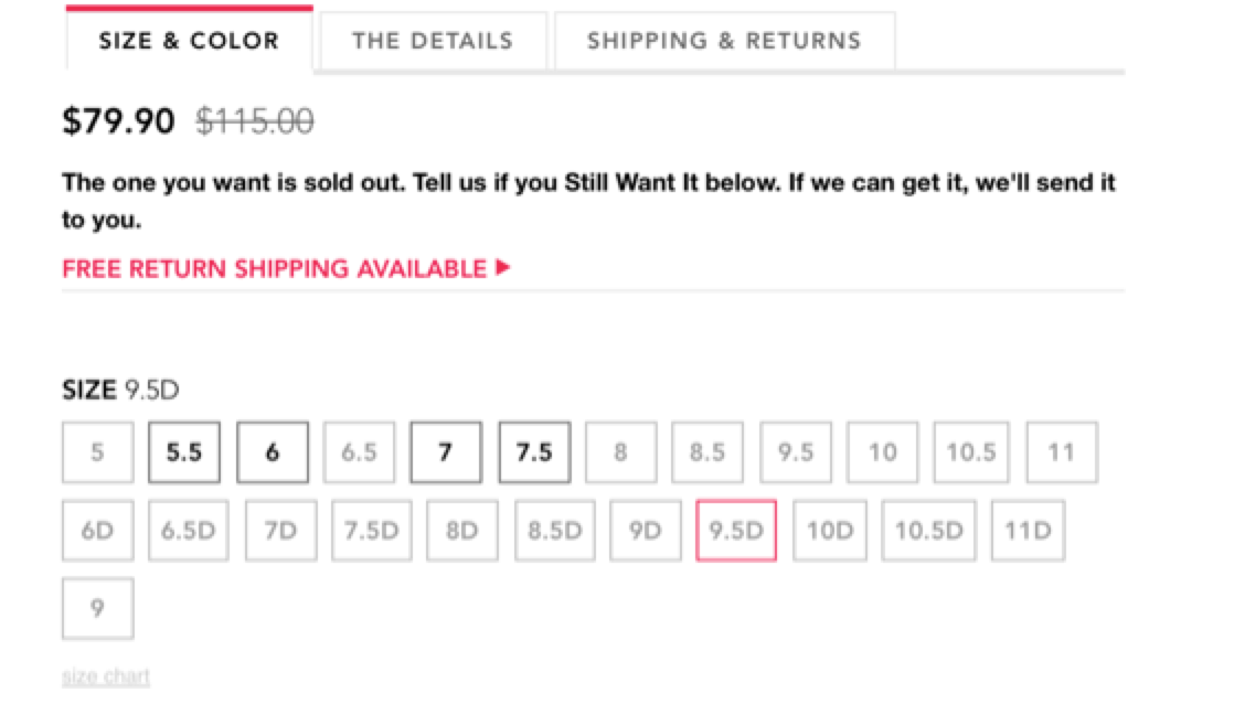
Refine by size gone bad
I realize there are reasons these things happen- someone made a business decision based on a technical limitation or a tradeoff on site speed vs. accuracy…there are always drivers for things like this. But the bottom line is the customer experience you deliver. If you make a promise (showing a refinement by size)- then you have to deliver on it well or there’s no point. A bad experience actually detracts from the perception of your brand (they don’t deliver!). Customers will bail on your site a lot faster when frustrated with the functionality.
This is just one tiny example of the many decisions brands make every day that impact customer experience. Make sure you understand the impact when you make the business decision. If it’s not worth doing right- it may not be worth doing at all.


