Posts from the ‘keeping it simple’ Category
If it’s chaotic and messy- no one will focus on the product. They’ll focus on the messy.

Recently I had some work done in my home, and every day, I knew the contractor was finishing up when I heard the vacuum cleaner running. Every day, I’d go inspect the progress, and the area would be spotless. The result was that the focus was always on the work that had been done- the progress made.
It was remarkable.
Partly because it exceeded my expectations, but mostly because the daily clean-up meant I could see and get excited about the product, instead of focusing on the mess of a work in progress. When the opposite holds true- a mess left behind, dust all over everything, debris scattered about- we can’t help but focus on the debris, and that shapes our opinion about the quality of the work.
This is a good way to think about our work- any work, whether it’s customer facing or internal business. If it’s chaotic and messy- no one will focus on the product. They’ll focus on the messy. If there’s too much information or it’s not clearly organized, it won’t be abundantly clear what your message is, or what you want people to DO with it.
This holds true whether you’re planning a website page, a presentation, or a company communication. Edit vigorously. Keep it clean.
If you want to be heard, do the hard work to make it simple.
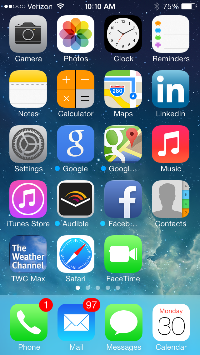
ios7 home screen
ios7 was a long time in the making- and a big move for Apple. It’s the first major break from the iconic visual design driven by Steve Jobs and the warm, homey graphics that made the techie device feel familiar: to-do lists that looked like lined paper, a bookshelf that looked like wood, and most importantly, easy to read text, links and buttons.
In this update, the new flattened design takes flat too far. The text is a pretty pale grey and the links a pretty pale blue, making both hard to read. All links are treated equally, so that “skip this step” and “next” links, for example, look exactly the same. The new tool icons are flat and colorless, which combined with the pale blue outlines- make them hard to distinguish. They just don’t pop off the page. The one that’s highlighted is great- if they were all treated that way, they’d seem less diminutive and more actionable.
![]()
I like the idea of modernizing the graphics, but this fails in the execution. The graphics are reminiscent of early web design that was less well attuned to customer experience mandates such as legibility, clear calls-to-action and ease of use. The newstand is still a newstand, and I can’t pull my New York Times out of it, so it continues to be two clicks away. The bookshelf design looks like something you might find in a windows app, with books floating on varying shades of blue. The safari icon looks like a compass. And I can’t find the new ‘easier’ to find spotlight search no matter what I do.
The critical issue: The text and link treatments are too pale. Too subtle. These are key elements of the design- and they need to be made legible.
The good stuff:

Swiping up opens the control panel- for easy access to itunes, sleep, airplane, bluetooth, and other modes.
On the upside, ios7 seems stable and has some great new features. The new control panel is fantastic- it puts key functionality one swipe away, instead of multiple clicks- you can now access sleep, do not disturb, airplane mode- and even a flashlight with a quick swipe. Love that.
The camera is noticably better- with easy controls, and more accessible controls for a panoramic shot, square or video.
And the new App scrolling feature is cool- with two clicks, you get mini screens you can scroll through to see what apps are open and click directly in. Very nice.
There’s lots to like about the new OS release. Though I’m not a fan of how far they took the flattened design, I believe it’s easily fixable. The critical need is to fix the oversimplified text and link treatments. I hope that Apple will recognize the need to do this quickly in upcoming releases. The rest is just a matter of taste.
But it’s not easy.
Scenario: You set out to make a list of the top 3 strategic initiatives and end up with 20. You just can’t help adding the rejects to the bottom of the list…or the little things. Just in case they make it. It makes everyone feel better to have them captured, so you keep them. But in fact, there’s nothing so demoralizing for the team as the list that never gets done. We need to stop thinking of it that way.
The top initiatives are just that. It doesn’t have to include the little things. The little things are the things we do everyday to support the big things.
Does your company excel at identifying the top few things? One company I worked for called it the “critical few initiatives”. It made it very clear, at all levels of the organization, how to make the right decision about what to focus on, everyday.
It’s not so different from having a clear brand position: once you have it, everyone can use it as a guiding light for behavior, decisions and how they articulate the voice of the brand and apply it to what they specifically do every day.
But why is it so hard to do? How do you do it well?
It’s hard because it requires sacrifice. You can’t do it all at once, with the resources you have. You have to know what’s really important. Startups do this everyday- they have a few good people laser-focused on a clear goal. So they get it done. I’ve been with big companies and little companies, and I can tell you that it’s not size that defines a clear business strategy- it’s courage. That’s right- it’s the courage to take a stand on what’s going to drive your business forward, rather than a mega diner-sized menu that will have something for everyone, and nothing spectacular for anyone.
J.Crew does this extraordinarily well.
Mickey Drexler, in one of his recent features in Fast Company, says: “Simplicity is very difficult to achieve.” But he has done it- over the past 10 years, with Jenna Lyons as the extraordinary creative lead- they have completely reinvented one of America’s favorite brands. They have a vision, and it has paid off, big time- with Michelle Obama and Jessie Jackson (this Jessie, not the reverend), among many others, as devoted fans to the brand. Why? They don’t do just what’s expected. They keep it fresh and creative. And they don’t try to have something for everyone. Each collection has a point of view. It has become the single most coveted American fashion brand at an affordable price point. You don’t achieve that by being indecisive about your priorities. You can find links to Fast Company’s recent features on Mickey and Jenna, here.
Learning Agile Methodologies helped shape my thinking about how to keep it simple. It’s a flexible, yet highly structured way to prioritize and execute on an on-going basis. It requires decisive action and attention on a daily basis to remain focused. And you can still keep your wish list (your backlog), on the fringes to pull from when each new sprint planning meeting comes up. This isn’t a long term strategic planning tool- but it’s a great way to organize the work to support your key strategies. What it does for strategic planning is give you a better sense of how much time things take- how to structure the research around your plans and whether they’re achievable in the desired time period. It’s a great way to support your strategy company wide, and keep everyone focused.
But it all starts with keeping it simple. You have to start by defining the high level goals. And then constructing a plan of the things you need to have in place to get there. And then editing, editing, editing down the list to the things that REALLY matter. And then staying focused, every day, on those things.
It’s not easy, to plan to do less. But what I’ve found in the past year is that planning to do less actually empowers you to do more- both because you don’t have to rethink your priorities every single day, and because you make a bigger impact with a few great things than with a zillion insignificant ones.


