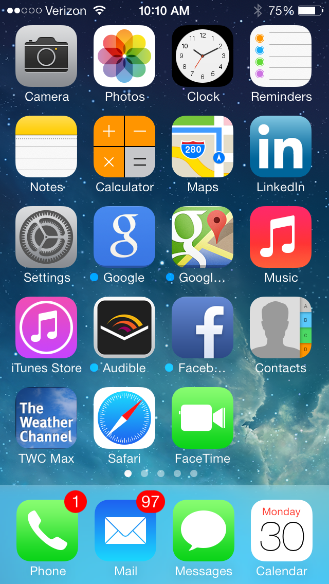
ios7 home screen
ios7 was a long time in the making- and a big move for Apple. It’s the first major break from the iconic visual design driven by Steve Jobs and the warm, homey graphics that made the techie device feel familiar: to-do lists that looked like lined paper, a bookshelf that looked like wood, and most importantly, easy to read text, links and buttons.
In this update, the new flattened design takes flat too far. The text is a pretty pale grey and the links a pretty pale blue, making both hard to read. All links are treated equally, so that “skip this step” and “next” links, for example, look exactly the same. The new tool icons are flat and colorless, which combined with the pale blue outlines- make them hard to distinguish. They just don’t pop off the page. The one that’s highlighted is great- if they were all treated that way, they’d seem less diminutive and more actionable.
![]()
I like the idea of modernizing the graphics, but this fails in the execution. The graphics are reminiscent of early web design that was less well attuned to customer experience mandates such as legibility, clear calls-to-action and ease of use. The newstand is still a newstand, and I can’t pull my New York Times out of it, so it continues to be two clicks away. The bookshelf design looks like something you might find in a windows app, with books floating on varying shades of blue. The safari icon looks like a compass. And I can’t find the new ‘easier’ to find spotlight search no matter what I do.
The critical issue: The text and link treatments are too pale. Too subtle. These are key elements of the design- and they need to be made legible.
The good stuff:

Swiping up opens the control panel- for easy access to itunes, sleep, airplane, bluetooth, and other modes.
On the upside, ios7 seems stable and has some great new features. The new control panel is fantastic- it puts key functionality one swipe away, instead of multiple clicks- you can now access sleep, do not disturb, airplane mode- and even a flashlight with a quick swipe. Love that.
The camera is noticably better- with easy controls, and more accessible controls for a panoramic shot, square or video.
And the new App scrolling feature is cool- with two clicks, you get mini screens you can scroll through to see what apps are open and click directly in. Very nice.
There’s lots to like about the new OS release. Though I’m not a fan of how far they took the flattened design, I believe it’s easily fixable. The critical need is to fix the oversimplified text and link treatments. I hope that Apple will recognize the need to do this quickly in upcoming releases. The rest is just a matter of taste.


Comments are closed.