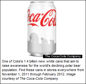
The marketers at Coca Cola seem to have forgotten one of the simplest principles of branding, with the recent “Save the Polar Bear” campaign.
Shoppers are visual. Our recognition of products is registered in the milliseconds we spend scanning the shelves for what we want. We do not stop to read or examine the things we buy often. We look for what’s familiar, pick it up, and go.
That’s exactly how I ended up drinking about 75 calories worth of a regular coke at lunch, before I got suspicious about the strange taste, looked more closely, and realized the word “diet” was missing. Turns out, lots of people had the same experience. According to the Wall Street Journal, Coca Cola’s response was that the white cans were distinctively different from the silver diet cans.
“Coke says it hasn’t tweaked the taste of its cola and that protecting polar bears is a worthwhile initiative. It recently added a “fact sheet” on its website highlighting how white Coke cans are distinct from silver Diet Coke cans. Among the differences: Regular Coke is labeled “Coca-Cola” and states the calories at the front of the can, while Diet Coke’s holiday can—silver as always—is labeled “Diet Coke” and features snowflakes.” – WSL 12.1.11
Let’s just agree that saving the polar bears is a right and good thing. But Coca Cola, changing the brand identity is confusing and distressing for consumers who feel duped, or annoyed at drinking needless calories. I’d like to have believed after the New Coke flub of 1985, they would have the institutional memory to be cautious about changing the brand too dramatically. Sadly, no.
Coca Cola has a website, Coca Cola Artic Home, dedicated to the Polar Bears, replete with geo-trackers, so you can choose a “virtual parcel” to donate to. It’s a lovely effort, and Coca Cola should be celebrated. But, folks, how did they lose sight of the fact that the people who buy coke and diet coke would be confused? The white can they designed to celebrate the polar bears looks almost identical to the silver diet can. The explanation that the silver is distinct is a clear case of snow-blindness. Perhaps they were too deep in the the artic blizzard to see it.
Tropicana did something similar a few years ago- they decided the brand was looking stale, so they updated the carton so dramatically that it was unrecognizable. They thought it should be more modern, clean, and elegant. The result was so clean that it looked like a generic. And those of us who were Tropicana customers walked right by it looking for the carton with the orange on it. Major brand flub.
There’s been huge consumer uproar about the white can, and Coca Cola has responded by saying that the red cans will be back on the shelves by Christmas.
A brand marketing guy I used to work with used to say, “Fall on your face, not on your ass”, to encourage risk taking on big ideas. I’m not sure which way Coca Cola fell on this one, but it appears that the lesson is learned. At least for now.


