Does having content above the scroll matter anymore? We know that consumers will scroll to see what’s on the page when they’re shopping. But where should we draw the line when it comes to content? What standards should we be following?

Taking a look at a few popular content sites, it seems many publications value highlighting something visually compelling vs. the actual story that consumers are linking to. When a customer is linking from a headline to see a story, should we make them scroll to see what the ‘story’ is about? To even see the headline to confirm they’ve landed where they intended?
Above is the Fast Company homepage- and below, a landing page for a story. Would a consumer landing here have any idea what the lead story is going to be about? Have they given us any incentive to scroll? The key factor to consider when designing landing pages is to provide at minimum:
1. A visual confirmation that I’m landing where I’ve intended.
2. Enough content above the scroll to generate the consumer’s interest and curiosity to keep going.
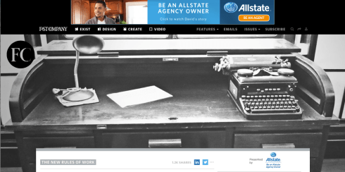

Interestingly, Fast Company’s mobile experience is much better- I can see the headline above the scroll. This is perfect.
Let’s take a look at TechCrunch. In this case, we have an image that relates specifically to the story (vs. Fast Co’s more esoteric images), and 2+ story leads above the scroll. This may be less dramatic visually- but it gets me to the stories.

Below is the landing page for a specific story on TechCrunch. I can’t see the story, but I do, at least get the headline I clicked on, to validate I’m in the right place.

The key consideration is: what are you trying to do? What do you want the consumer to do when they land on the page? What do you want people to remember you for? If it is about the story, Tech Crunch is doing a better job here. I can at least see the headline that enticed me in the first place.
Fast Company, in designing for online, is making the decision (whether intentional or not), that the photography is the most important thing they want consumers to see. As a consumer, it makes me nuts that I can’t see the story- or even the headline, above the scroll. Not on my laptop, nor my 22″ monitor- though the experience on the iPhone is much better. As a consumer, I like having a meaningful image, but find it irritating when I’ve clicked on a link from Facebook or Linkedin to land on a page where that’s all I see. I clicked because I was interested in the story.
Just give me the story.
Is your customer service an oxymoron? Is it geared towards helping your customers, or avoiding them? Here’s what great customer experience looks like to me:
1. Customer calls company “A” and wants to speak to a customer service agent.
2. Customer is able reach a human agent within 30-60 seconds (and without a gauntlet of CG voice options and having to punch in excessive numbers).
3. Agent actually has the information the customer has punched in (account number, issue type, etc) and greets customer by name.
4. Agent resolves problem fairly and quickly, and life is good.
This seems like a very simple interaction. But recently, when I had one like this, I found myself overflowing with gratitude. I steel myself for these calls- expecting the worst, because I’ve been conditioned to expect the worst, through endless frustrating calls that went more like this:
 1. Customer calls company- get electronic message asking customer to select one of 5 choices. Customer doesn’t want any of these choices- customer wants to talk to a human.
2. Electronic voice says that she understands that I’d like to speak to an agent, but to help, she’ll need the following information entered.
3. Customer enters information, gets a new menu of options. None apply. Customer wants a human. Customer presses “0”. Machine says “this is not a valid response”. Customer says, “I WANT A HUMAN”. Machine says, “that is not a valid response. To repeat the menu, press 1.” Menu repeats. There’s no option for a human.
4. Customer implodes.
5. Customer starts over, process begins anew. Eventually reaches human. By this time, customer is hostile, frustrated and exhausted. Agent asks for all of the same account information customer has already entered.
6. Customer implodes.
You get the idea.
It shouldn’t have to be like this.
I really wonder how much actual revenue it costs companies in the long term- do companies actually quantify the time wasted dealing with hostile customers, and look at how that could be prevented? What’s the lost revenue by attrition when the customer decides not to deal with them anymore? If they really did the math, they would see that it’s much less expensive in the long run to provide good, or even great service. Think retention, appreciation, brand loyalty. That’s revenue. Many retailers get it. Especially online retailers. And granted, that process is simpler- and faster. But when it comes to customer support for longer term products like computers, or printers, health insurance or banks- not so much.
Why do CEO’s allow this kind of experience to persist?
Almost certainly because they don’t experience it for themselves. This is the advice I’d give- and it’s same advice I give top leaders and CEO’s for their websites: experience it for yourself. Frequently.
Give yourself a scenario (my product arrived damaged, never arrived, stopped working, or I’m calling to understand why my claim was denied, and so on). Call your own Customer Service number and see you how feel when you’re done. And then ask yourself, “Is our customer service an oxymoron?” Answer the question.
You’ll know what you need to do.
There is such a thing as overdoing your video content. When there’s a message I could just as easily (or more easily) scan via text- just give me the text. I can’t even count how many times I’ve clicked on an interesting link from Facebook, Linkedin or news media sites only to find that it’s a video link, and I can’t get to the content of the message unless I’m willing to wait through the ad, then sit through the video.
Video has it’s place- for entertainment, or education. But for news or content, give me text. I don’t want to have to go through it at a video’s pace- I want to see what it’s about and quickly move on.
What’s the best practice?
First, your link or image should clearly show that it’s a video- or you’re misleading me.
Second- provide the text transcript as an option.
Let the user have control over the experience.
Starting April 21, retailers are going to see a major change in their Google rankings. Some are calling it “Mobilegeddon”. A bit dramatic, but the drama isn’t entirely unfounded. If your site is not mobile friendly, you’ll get punished in the rankings. And it’s not just about having a mobile site anymore- it’s about having truly mobile friendly pages, where you can read the text and navigate & transact without zooming in. This has been a long time coming.

The new Google algorithm “Mobilegeddon” or “shopper heaven?”
Mobile has been heading towards this tipping point for years. Google says they’re just responding to the data: more people are shopping with mobile devices than ever before. Over half of the shoppers interacting with retailers are now doing it on their tablets or phones- for research, browsing and transacting. Google says they want to be able to deliver results that will be more relevant.
What this means for sites that aren’t yet responsive or mobile friendly is that organic traffic could take a significant dive- as Google sinks them in the rankings.
Is this going to make it better for shoppers? Or just harder for shoppers to find the sites they want? Time will tell. Larry Dignan, Editor In Chief of Zdnet, says that this move could have major blowback for Google, in his post:
Google’s mobile friendly algorithm change on deck: The case for blowback
Dignan makes the case that if businesses are not mobile ready, Google’s results may not be as relevant to the shopper, and could backfire on Google as the search results become less compelling, or simply- not what the customer wants.
Time will tell. “Mobilegeddon” or not, you’ll want to take a look at how Google sees your site. Take the Mobile Friendly test on Google to see how your site shapes up.

Whether Google sticks with the new algorithm or not, you’ll want to get working on a responsive site. It’s how your customers are shopping now, and ultimately it will serve them- and you, much better.
Amazon’s New “Exclusives” Shop Showcases Up-And-Coming Brands And “Shark Tank” Products
March 11, 2015
jessonline

Interesting to see Amazon getting in on the Etsy/Quirky/kickstarter creative, individualist, inventor scene. It’s good to see the increased opportunity for entrepreneurs to get the exposure.
Googling. How great it is that we can find a recipe, resolve a difference of opinion, or learn the meaning of a word- in two seconds online. It’s immediate gratification. Love it.
But of course, just because it’s out there doesn’t mean it’s true. I recently tried to find the source for a Wordsworth quote I liked on Pinterest: “To Begin, begin”. It was all over Pinterest, all over Google and Yahoo answers- in chat rooms, images, and inspirational quote sites.

I thought it was a wonderfully simple philosophy to get past the blocked feeling we sometimes get when embarking on a difficult or challenging project. I was going to start a post with it, but first- I looked for the source. No google reference I found could identify one. I found a poetry site with all of his works, and got a ‘not found’ result when I searched the text. So I asked a professor- a Wordsworth expert, who said not only does it not sound like him- there’s no reference she knew of that he ever said it.
So could he have said it? Who knows. I’m not going to quote if I can’t verify it. Maybe someone distilled something he said down to that- and it became attributed to him over time. It was a small thing, but surprising. A good reminder that in all things, we should know our sources before we take action on information. Trust- but verify.
If it’s chaotic and messy- no one will focus on the product. They’ll focus on the messy.

Recently I had some work done in my home, and every day, I knew the contractor was finishing up when I heard the vacuum cleaner running. Every day, I’d go inspect the progress, and the area would be spotless. The result was that the focus was always on the work that had been done- the progress made.
It was remarkable.
Partly because it exceeded my expectations, but mostly because the daily clean-up meant I could see and get excited about the product, instead of focusing on the mess of a work in progress. When the opposite holds true- a mess left behind, dust all over everything, debris scattered about- we can’t help but focus on the debris, and that shapes our opinion about the quality of the work.
This is a good way to think about our work- any work, whether it’s customer facing or internal business. If it’s chaotic and messy- no one will focus on the product. They’ll focus on the messy. If there’s too much information or it’s not clearly organized, it won’t be abundantly clear what your message is, or what you want people to DO with it.
This holds true whether you’re planning a website page, a presentation, or a company communication. Edit vigorously. Keep it clean.
If you want to be heard, do the hard work to make it simple.
Sounds simple, doesn’t it? If you add functionality to your site, you have to know what the customer expectation will be- and deliver on it. Getting it ALMOST right is the same as getting it wrong.
Here’s an example: one day, I was shopping on one of my favorite flash-sale sites- amazing brands and products at unusually great deals. What’s not to love? But there are so many items, and I have limited time and patience. That’s why I was so glad to see a refine-by-size feature that allows me to sort by just the product that would work for me- good! That’s a best practice, especially for a sale in which quantities are limited.

Refine by size feature- a best practice.
The rub? When the refine-by-size feature doesn’t deliver real-time information, it’s worse than having no refinements at all- because you’ve set my expectations for a personalized result, but then let me down on the delivery. Advice? Turn the refinements off until you can get it right. It’s not a value-add if it’s only right sometimes (like a faulty clock: it’s right at LEAST twice a day…).

Refine by size gone bad
I realize there are reasons these things happen- someone made a business decision based on a technical limitation or a tradeoff on site speed vs. accuracy…there are always drivers for things like this. But the bottom line is the customer experience you deliver. If you make a promise (showing a refinement by size)- then you have to deliver on it well or there’s no point. A bad experience actually detracts from the perception of your brand (they don’t deliver!). Customers will bail on your site a lot faster when frustrated with the functionality.
This is just one tiny example of the many decisions brands make every day that impact customer experience. Make sure you understand the impact when you make the business decision. If it’s not worth doing right- it may not be worth doing at all.


